
Friday, December 17, 2010
Wednesday, December 15, 2010
Final
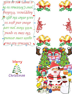
This is my final project; a holiday card; as a test to see whether or not I deserve to pass this class. I started off with the montage –bottom right- thinking that, that would consume the most of my time. In reality, it did, but I still had enough time to finish up the logo –bottom left-, the Christmas greeting –top left- and the “free creation”. Though the top right corner may seem blank (aside from a few images) I did that in hopes of printing this out and using it for an actual Christmas card, with the [insert family photo here] caption.
This final has been very helpful because it makes me think that maybe I am ready to pass this class. Maybe all of the tutorials I did in the beginning of the year were worth the time and effort. I have learned that there is a purpose for all of the things people do, even if it may not seem obvious at first. I have also learned how to make my own Christmas card; based on the layout and the folds used in the template. I no longer have to go out and buy one of the illustrious cards to send to the family, because now I can make my very own. And it doesn’t have to be perfect or beautiful as long as it is meaningful to the person sending/receiving the card. For these reasons I think I have learned all of the things I have to in completing my final.
Thursday, September 23, 2010
Project 1 Collages
 My project is based on, of course the New York skyline with a slightly starry night. I used Saturn and the shooting star to help show dimensions along with the clouds. I also used the ripple effect on New York’s reflection to reveal some life and authenticity, but at the same time give New York kind of a "pop-up" look. I put the second moon by free transforming the first; in what I wanted to be a pieces sign but decided against it. I also added a few stars to the, what was once a bland, night sky so give color.
 I chose this form of collage because, I like the sky best when night breaks out and New York because I thought it would be best to interpret how though people never stop and we may always think things need to be done in a deadline, the world never stops turning and even the sun needs a break half of the time. I hope for my image to show the life in the world as well as the rest and peace in space. The shooting star is supposed to represent hope, a wish yet to be made. I chose the overall color scheme to be a dark one yes but as well as a bright one. Though it may not be eye-catching to some because it is so dark, I believe that if it were to be any other color the same story wouldn’t be told nor would it be heard the same way.
 This is my second project, based on a quote from Google, I chose a picture of a hand reaching out and gripping the other. As a sign of reassurance, so that if you reach for the moon -or a great achievement- even if you miss you will land on a star. By that the quote is talking about you will learn from you mistakes and will get a step closer to your greatest achievement.
 Article Abstract Link:
Thursday, September 2, 2010
PhotoShop Tutorial 14
I had a lot of fun with this project, the color schemes of the water's light reflection and the dark hollowness of the hill besides it is just perfect. In this picture however I removed a rock that I found was just there to be there and a good portion of the hill -located on the right of the picture- as well as the bordering hill -the one located on the left. I'm not too proud of the mistake I made,when i was removing the first hill i miscalculated the mist coming from the waterfall and ow I think it looks rather awkward, but still good. This picture I will defiantly use for reference when I use this application again, and believe me I will be using this a lot in the future.

PhotoShop Tutuorial 8
This project, I really liked because of the scenery. I think it gave this picture more of a "country" feel because it's as if you opened your oun back door and saw a nice field out back; no need to worry about the city life.I used the skew effect on this, though I didn't do a perfect job I still like the outcome because the space matches the sky very well. Also the color scheme of the door, a nice almost blue-grey color in contrast to the green pattern wall paper. This task was slighly challenging but nothing impossible after I learned which tools to use.

Tuesday, August 31, 2010
PhotoShop Tutorial 6
I rather liked this tutorial because of the wind effect blowing on the text. Looking back at it, my color choices could have been better had I known this would be the outcome. I also could have come up with a more creative word other than "thunder", but I'm not going to sit here complaining over nothing. In the future I may use this effect for future projects, say a Power Point Presentation that I want to improve or on my website later on. One thing is for sure however I definitely need to improve my skills on the tutorial.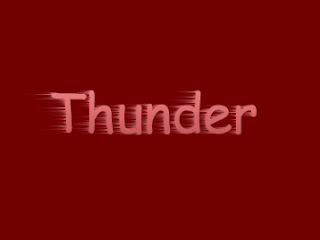

PhotoShop Tutorial 7
In this picture, however similar it may seem to the other one done in tutorial 67, is much different. In this project I merely took the image of a white water lily and morphed it into looking like a hand sketched image. Though I'm not particularly keen on the fact that the black tends to clump together and then spread apart, it does give it that pointillism look. Having a more defined line where the dots are compacted together and a less defined area where the points are well spaced apart. In the future, I may wish to use this project as a reference for when my little cousins want to color on a coloring page and they don't have one, I can look back at this and remember exactly how I did this.

PhotoShop Tutorial 84
This project, though it may look relatively simple, I had slight difficulties with. The main reason being is that I think I made a mistake along the way on the first time around. I liked it, doing this project taught me that sometimes I need to slow down and analyze what I am doing rather than just rushing into a project. I may use this project later on, if I ever decided to use a "bad code" background on a project or give it some defined features. I am sure that in the future when I learn more about the Photo Shop Applications I will be able to improve this project greatly.

Friday, August 27, 2010
PhotoShop Tutorial 26
This is the second to last of my tutorials and one of the easier, well I thought it was one of the easier, projects. Though it was easy it still gave me a lot of in site on which tools and icons go for each settings. I learned how to blend the colors in the text, how to center it as opposed to having it in the top left corner. I could probably use this project as a reference in some of my other projects done using the Photo shop application in my multi-media class, just to remind me of how I did this and maybe even later how I could improve this project.

PhotoShop Tutorial 67
This one out of all of them has to be my favorite. The simple reason because this one was the picture that I used to explore some new tools. First I got the picture of a water lily and then I edited it to give it that "hand drawn" feel, or at least I think it looks that way. And then I went back to following the directions by adding that rainbow, I do admire the colors because before it looked like a simple water lily. Now, however, I think it looks above and beyond with the radiant colors. Again, I say that this one is most defiantly my favorite photo shopped picture ... along with the one of the music notes I posted on the 1-5 tutorials.


Tuesday, August 24, 2010


Subscribe to:
Posts (Atom)