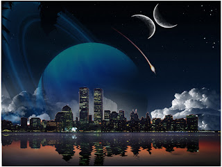
 My project is based on, of course the New York skyline with a slightly starry night. I used Saturn and the shooting star to help show dimensions along with the clouds. I also used the ripple effect on New York’s reflection to reveal some life and authenticity, but at the same time give New York kind of a "pop-up" look. I put the second moon by free transforming the first; in what I wanted to be a pieces sign but decided against it. I also added a few stars to the, what was once a bland, night sky so give color.
 I chose this form of collage because, I like the sky best when night breaks out and New York because I thought it would be best to interpret how though people never stop and we may always think things need to be done in a deadline, the world never stops turning and even the sun needs a break half of the time. I hope for my image to show the life in the world as well as the rest and peace in space. The shooting star is supposed to represent hope, a wish yet to be made. I chose the overall color scheme to be a dark one yes but as well as a bright one. Though it may not be eye-catching to some because it is so dark, I believe that if it were to be any other color the same story wouldn’t be told nor would it be heard the same way.
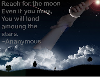
 This is my second project, based on a quote from Google, I chose a picture of a hand reaching out and gripping the other. As a sign of reassurance, so that if you reach for the moon -or a great achievement- even if you miss you will land on a star. By that the quote is talking about you will learn from you mistakes and will get a step closer to your greatest achievement.
 Article Abstract Link:

